
Loading
Nashville, TN
Selective · 0 of 3 programs pay back
1,163 undergraduates, 12 students for every faculty member · NAIA Division I athletics
Estimated over 20 years
-$94k
Business Administration Management and Operations
Estimated over 20 years
-$152k
Biology General
No program here leaves a graduate ahead of not going. After 20 years each one returns less than a typical high-school graduate in Tennessee earns by going straight to work, once four years of what this college costs and four years of wages given up are counted. They are listed from least to most costly, and the figures are not ranked, because none of them won anything.
This college's programs pay similarly, so a single figure for the college as a whole is a fair summary of it.
Every college here returns more than this one’s best program, within 250 miles. Only 25% of students here come from TN, so the search is wider than the usual 50 miles: for a college people travel to, the colleges down the road are not the real alternatives.
Some of these admit a different share of applicants, marked on each row. A more selective college is a different application, not a free upgrade, and part of why its graduates earn more is who it admitted in the first place.
 University of GeorgiaManagement Information Systems and Services · Athens · 247 mi · $113,184 annual earnings 4 years after graduation, a median across 194 graduates$888k
 Samford UniversityPharmacy Pharmaceutical Sciences and Administration · Birmingham · 187 mi · $119,888 annual earnings 4 years after graduation, a median across 186 graduatesadmits 70%+$780k
 Indiana University-BloomingtonComputer Science · Bloomington · 208 mi · $114,199 annual earnings 4 years after graduation, a median across 101 graduatesadmits 70%+$758k
 DePauw UniversityComputer Science · Greencastle · 240 mi · $120,076 annual earnings 4 years after graduation, a median across 34 graduatesadmits 40-70%$751k
 Clemson UniversityInformation Science/Studies · Clemson · 246 mi · $105,646 annual earnings 4 years after graduation, a median across 24 graduates$720k
Campus photographs: University of Georgia by Josh Hallett from Winter Haven, FL, USA (CC BY-SA 2.0); Samford University by Brian R. Mooney / Sweetmoose6 (Public domain); Indiana University-Bloomington by IT Communications Office / Alan Mauro, Indiana University (CC BY 2.0); DePauw University by Nyttend (Public domain); Clemson University by Dick Rochester / Let Ideas Compete (CC BY-SA 2.0)
Holding the subject fixed and changing the college, for this college’s three strongest programs. The list above compares whole colleges at their best; this one answers the narrower question a student who already knows their subject is actually asking.
 Georgia Institute of Technology-Main CampusAtlanta · 214 mi · $106,155 annual earnings 4 years after graduation, a median across 275 graduates$846kUniversity of GeorgiaAthens · 247 mi · $80,881 annual earnings 4 years after graduation, a median across 181 graduates$457k
Campus photographs: Georgia Institute of Technology-Main Campus by Joseph Zollo (CC BY 2.0); University of Georgia by Josh Hallett from Winter Haven, FL, USA (CC BY-SA 2.0)
 Vanderbilt UniversityNashville · 1 mi · $71,584 annual earnings 4 years after graduation, a median across 30 graduates$336kUniversity of GeorgiaAthens · 247 mi · $59,446 annual earnings 4 years after graduation, a median across 274 graduates$171k
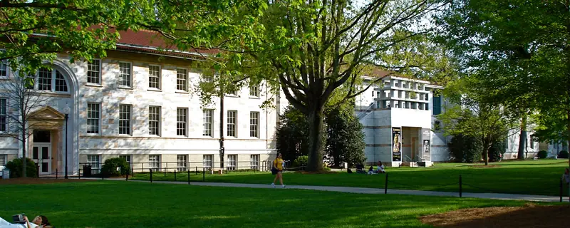 Emory UniversityAtlanta · 216 mi · $59,628 annual earnings 4 years after graduation, a median across 54 graduates2 campuses$135k
Campus photographs: Vanderbilt University by Stablenode (CC BY-SA 4.0); University of Georgia by Josh Hallett from Winter Haven, FL, USA (CC BY-SA 2.0); Emory University by Mpspqr (Public domain)
Clemson UniversityClemson · 246 mi · $65,577 annual earnings 4 years after graduation, a median across 171 graduates$204kUniversity of GeorgiaAthens · 247 mi · $60,366 annual earnings 4 years after graduation, a median across 165 graduates$184kCampus photographs: Clemson University by Dick Rochester / Let Ideas Compete (CC BY-SA 2.0); University of Georgia by Josh Hallett from Winter Haven, FL, USA (CC BY-SA 2.0)
Measured from federal filings, not from a survey. Each figure is compared against four-year colleges, because medians differ too much between sectors for a national comparison to describe anything but the sector.
Compare Fisk University with another college · up to four side by side, on return and on what each place is like.
Share of the 374 students who entered as first-year undergraduates in 2024. The states shown are the three largest outside Tennessee, so these do not add to 100%.
Total gain after 20 years is what a graduate is ahead at that point: what the degree pays above a high-school graduate in the same state, less four years of net price and the wages given up while studying, weighted by the share of students who finish. At this college that share is 30%, and it is the same for every program on this page because the federal data reports completion for the institution rather than for individual programs. Four-year and open-admission colleges are ranked separately and never pooled.
Annual earnings 4 years after graduation is the median earnings of that program’s graduates at that point, for students who received federal aid, and is published by program. There is no program-level cost anywhere in the federal data, so net price is the college’s figure applied to each program alike. That is sound for ordering programs against one another and should not be read as a precise figure for any one of them.
Cost on this page is always net price, never the published sticker price. Net price is the college’s full cost of attendance for a year, meaning tuition, required fees, books and supplies, and housing and food, with grant and scholarship aid from federal, state and institutional sources subtracted. Loans are not subtracted, because a loan is not a discount. It is an average for first-time full-time undergraduates receiving federal aid, reported by the college in the income bands shown, so it describes a typical family in that band rather than any particular one. A student living at home, paying out-of-state rates or holding an outside scholarship will not see this figure.
Federal loan debt comes from the College Scorecard and is a median among students who borrowed, not an average across everyone. A college where few students take loans can show a high figure and a small bill for most families, so the share who borrow is printed above it and neither should be read without the other. It counts federal student loans only: private loans and Parent PLUS borrowing are not in it and are not published anywhere comparable, which makes this a floor on what a family owes rather than a total. The figure for students who leave without finishing is the same loans without the degree they were taken for. Default rates are deliberately absent: federal repayment was suspended, so the published three-year rate is zero at almost every college in the country and says nothing about any of them.
Most-awarded programs are degrees conferred in AY2025, first majors only, so a double major counts once. Where two programs are within a few degrees of each other the order between them is not meaningful.
What this college is like compares each measure against four-year colleges, because medians differ too much between sectors for a national comparison to describe anything but the sector. A position of “higher than 90%” means the college matches or beats nine in ten of them on that measure, which is why the measured figure is printed beside it. Six of those measures have a better end and carry a mark; the rest are positions with no better end and carry none. There is no overall score, because combining them would need weights and the weights would be our opinion rather than a measurement.
Sources. IPEDS, the Department of Education’s annual survey, except where stated. Each block in the column beside shows its own year, because the underlying files are released on different schedules and a single date across all of them would be false. Published tuition is a sticker price and is never used as a cost; net price is. Test scores are the middle 50% of enrolled students who submitted a score, not of admitted applicants, which is why they differ from the figures other guides print. Where a US News rank is shown it is the current edition, published as a fact about the college rather than an endorsement of the ranking.
The photograph at the top of this page was taken by a member of the public and published under a license that permits reuse with credit. It is not supplied by the college, is not endorsed by it, and shows one building on one day rather than the campus as a whole. We do not generate campus images or buy stock photographs of real places, because a picture of a campus that is not that campus is a lie about somewhere real. Full credit: "WTN EVula 184.jpg" by EVula, via Wikimedia Commons, CC BY 3.0. Source: https://commons.wikimedia.org/wiki/File:WTN_EVula_184.jpg. License/status: https://creativecommons.org/licenses/by/3.0.